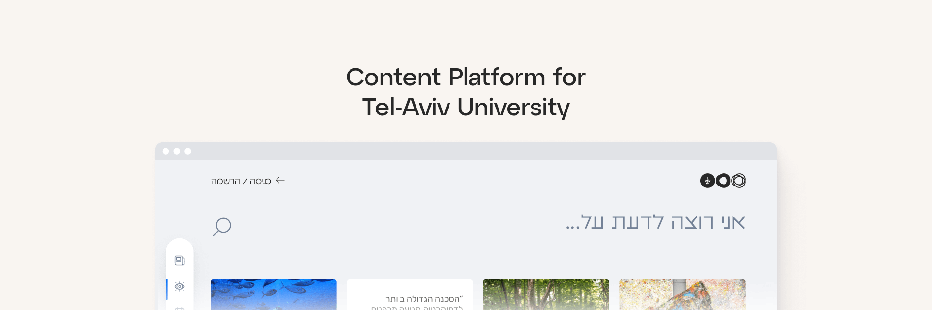
Content Hub For Tel-Aviv University
Role: UX Research, UI Design
Project Type: Content Platform
Time: April 2022
Client: Tel-Aviv University
Client
Tel-Aviv Uni
Project type
Content Platform
Role
UX Research, UI Design
Time
April 2022
Background
Tel-Aviv University required an all-in-one solution that would promote educational content across four types of channels: articles, videos, podcasts, and events, and be an alternative to all channels they have today.
The Problem
How to design a platform that seamlessly integrates four types of content and provides a user-friendly experience?
As I started the research I understood that the primary issue in developing an all-in-one platform that combines multiple types of content is the integration of diverse content formats.
My main challenges were:
- Bring together diverse content types, including text, images, and video, and define how users will interact with them.
- Engage users and enhance the research and discovery experience.
- Design a platform with intuitive navigation and user-centered design to meet the diverse needs of users.
Design Process
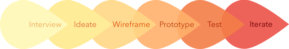
I conducted research, including competitor analysis and user interviews, and performed usability testing to validate design decisions. I designed wireframes, built mid-fi screens, and created a prototype to demonstrate platform functionality and flow.
Project objectives
- Provide a centralized platform for accessing a wide range of educational content.
- Improve the accessibility and convenience of educational resources for learners.
- Provide engaging and interactive content consumption.
Research
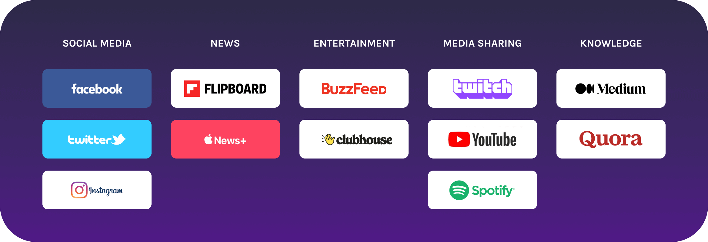
1. Explore other platforms
Before making layout decisions, I had to explore how people use the content on other platforms and see if I can spot common issues that users encounter and that interfere with their goals. I researched various social platforms:
2. Categorizing my Content
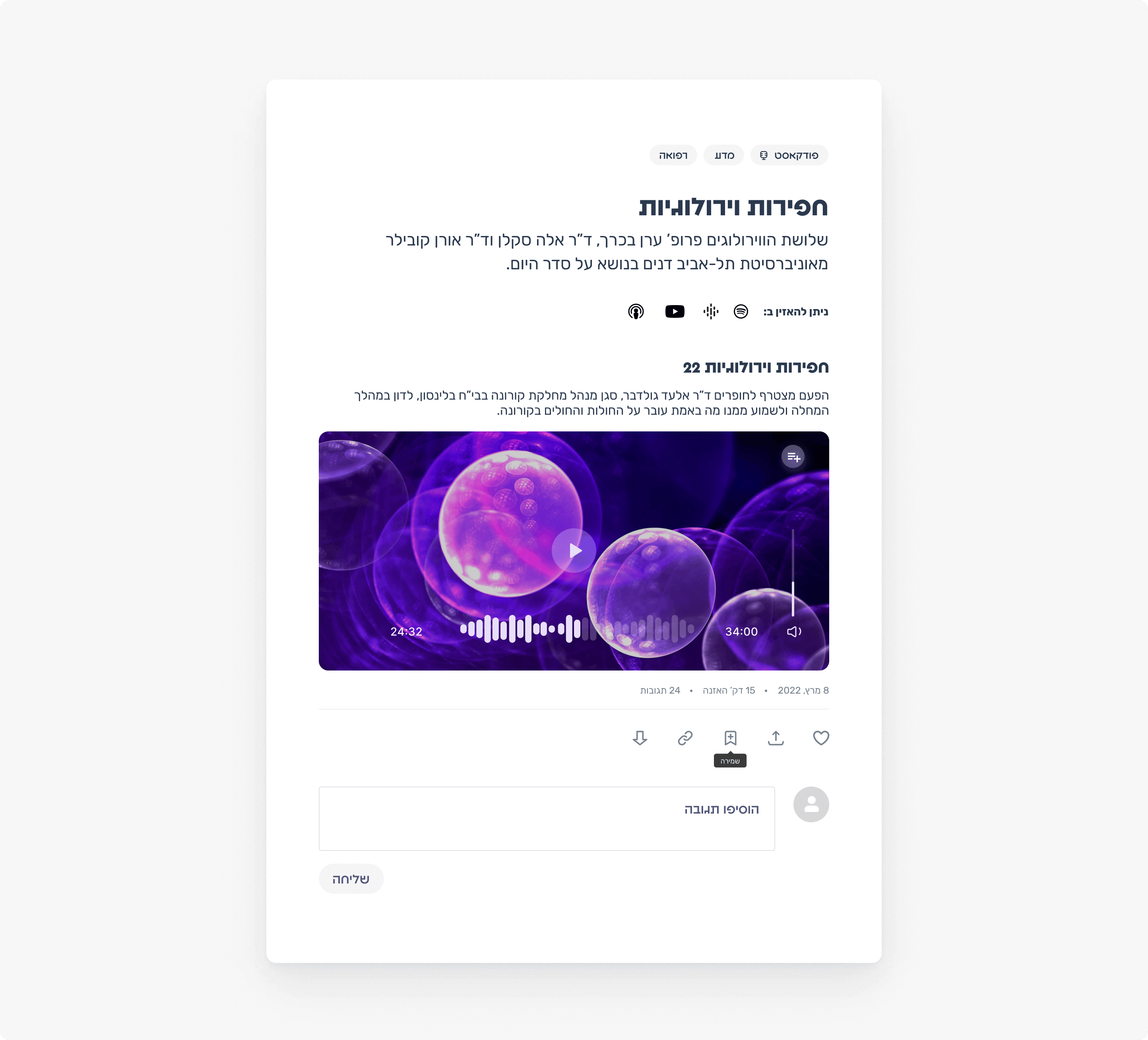
The university requested that we refer to podcasts, videos, articles, and various events they hold for the general public.


Dividing the content into a few categories is the foundation of how the platform will function.
3. Target Audience
After the initial understanding of the data, we went on to decide the audience we were catering to. Based on the information given to us by the university, we're designing for adult learners.


Interaction Model
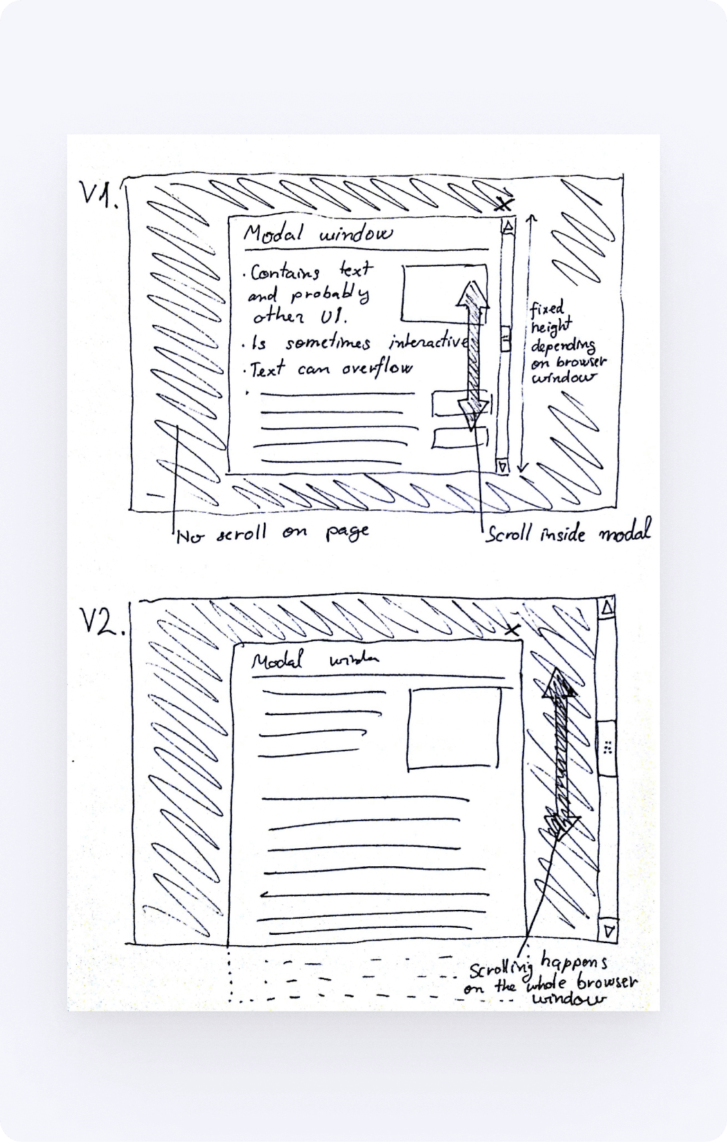
Sketches & Wireframes
I started by sketching alternate interaction models to reimagine the platform navigation. The interaction models that I sketched were intended to match content consumption based on users’ interests.
Information Architecture
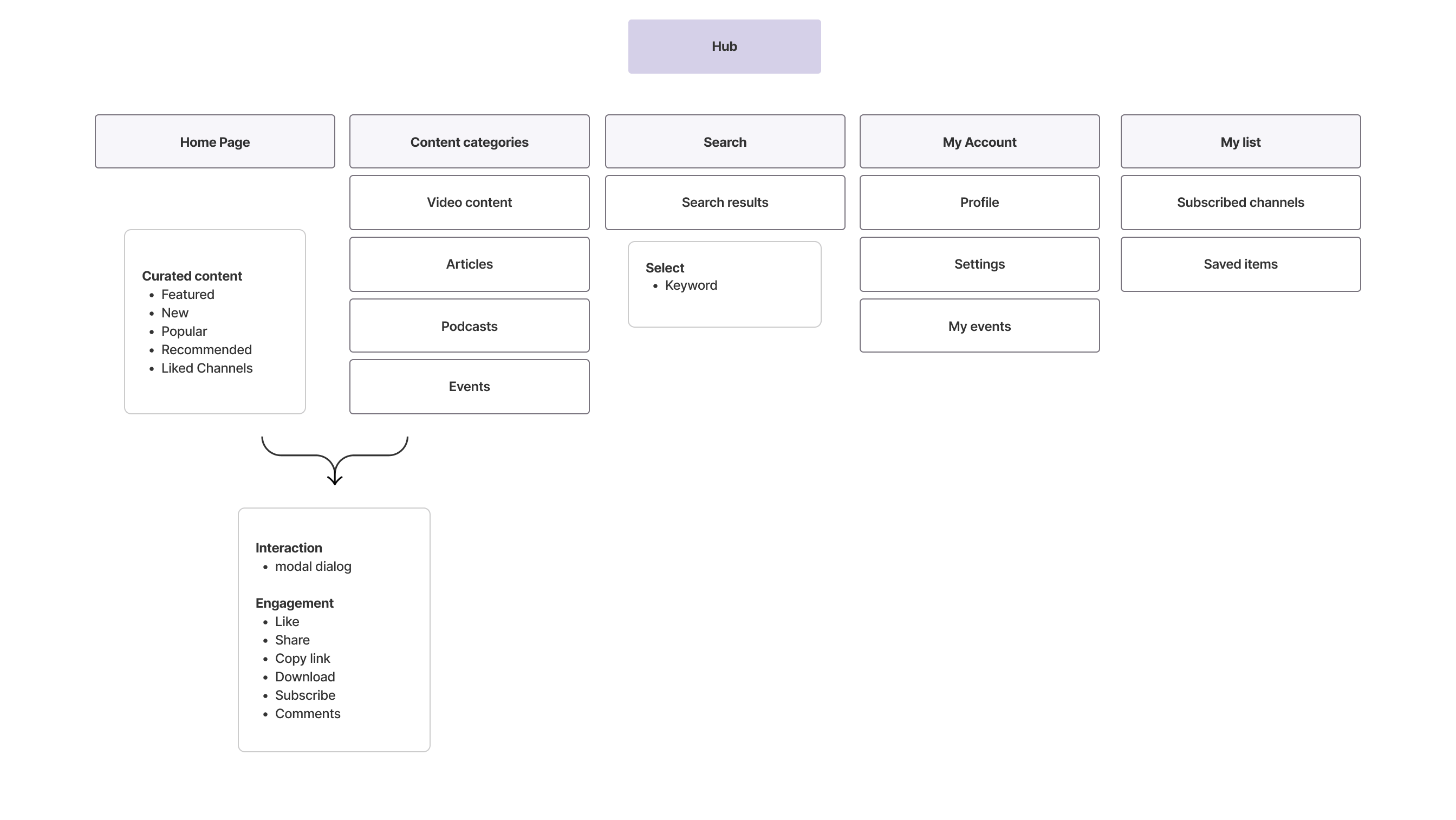
Main Screen- Deciding the Layout
My goal in these designs was to bring the content forward, and where possible make the content itself represent the navigation of the system, in an effort to reduce the decision fatigue that was resulting from endless scrolling.
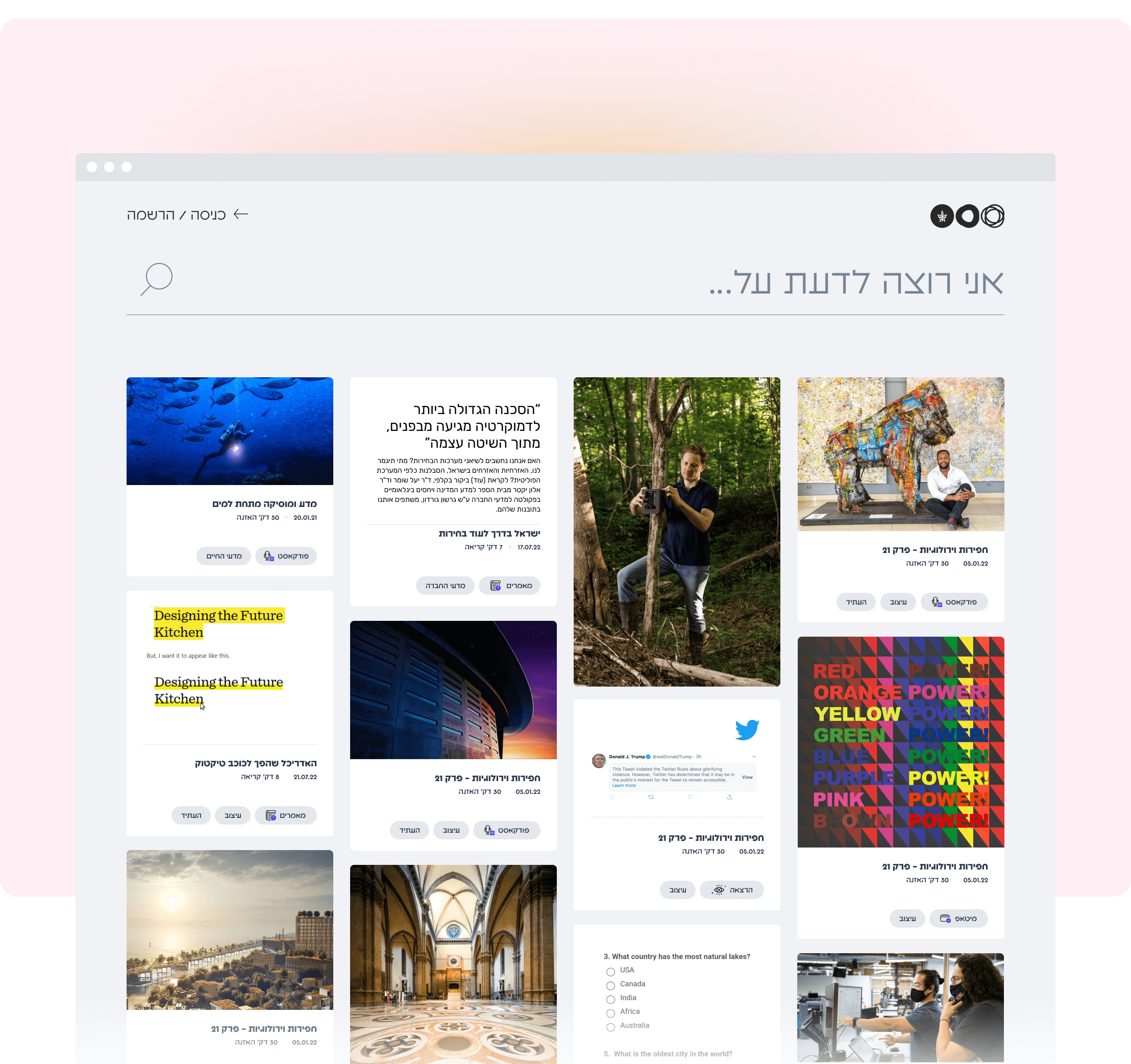
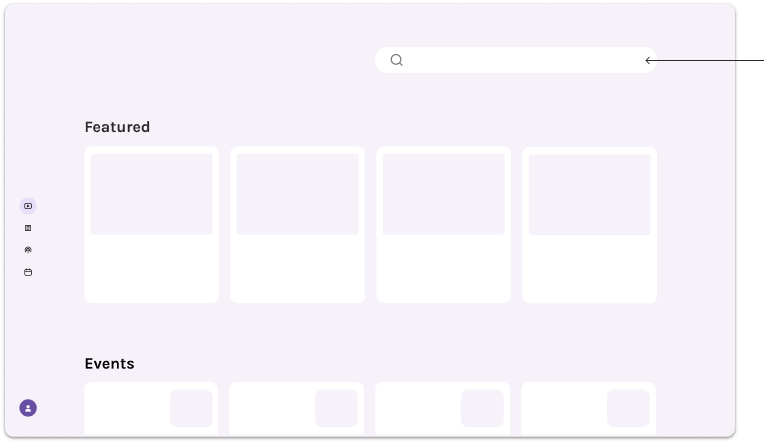
Card Layout
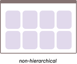
I choose card view to display content. This layout is for the most part non-hierarchical, meaning that no one item truly stands out over the others, and all of the information is treated equally.
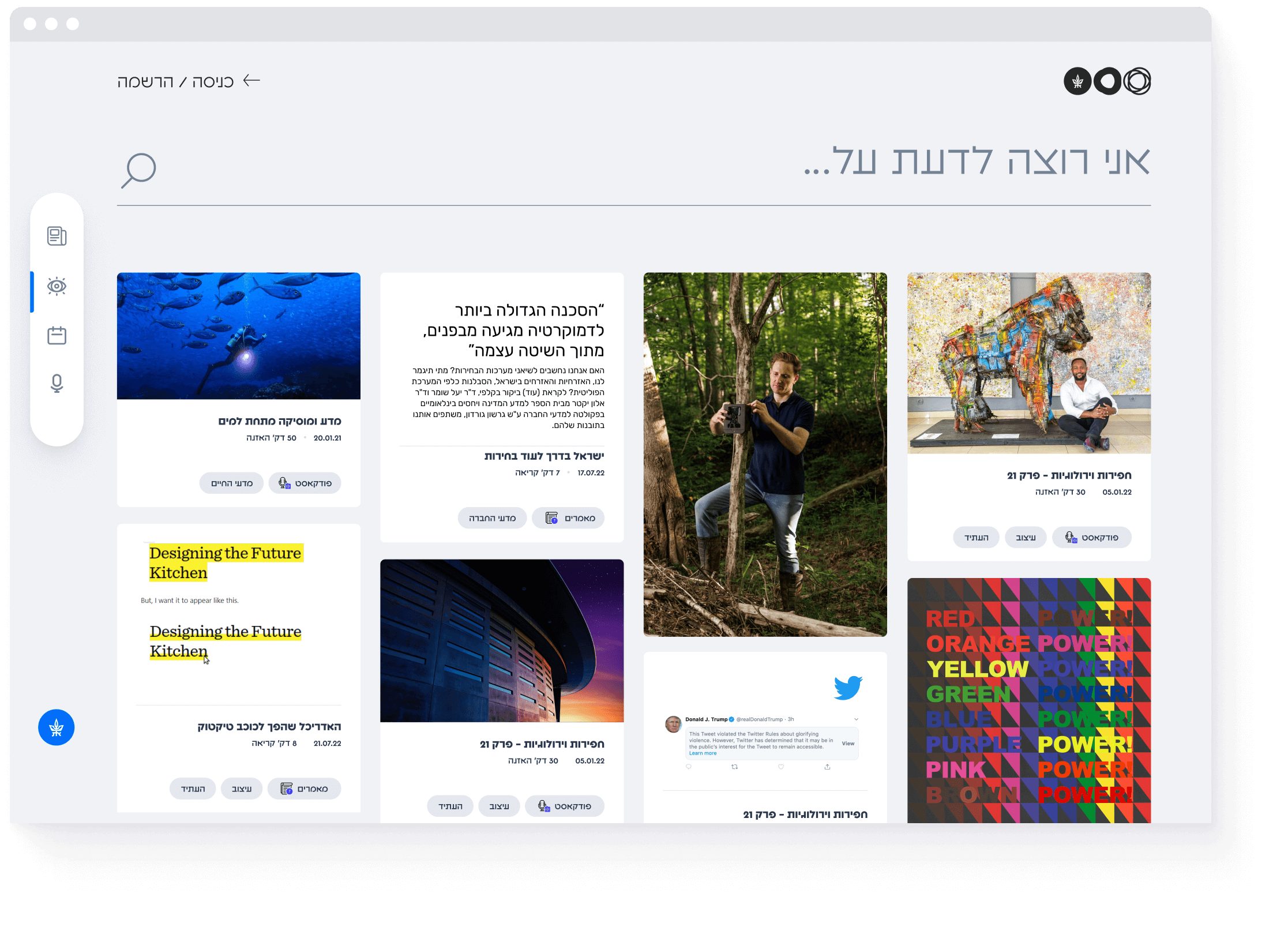
Search
The context comes when the user starts typing in a keyword, providing viewers with a way to consume content that meets their unique needs.
Card layout allows intuitive and approachable browsing despite a large amount of information, improving the user experience.
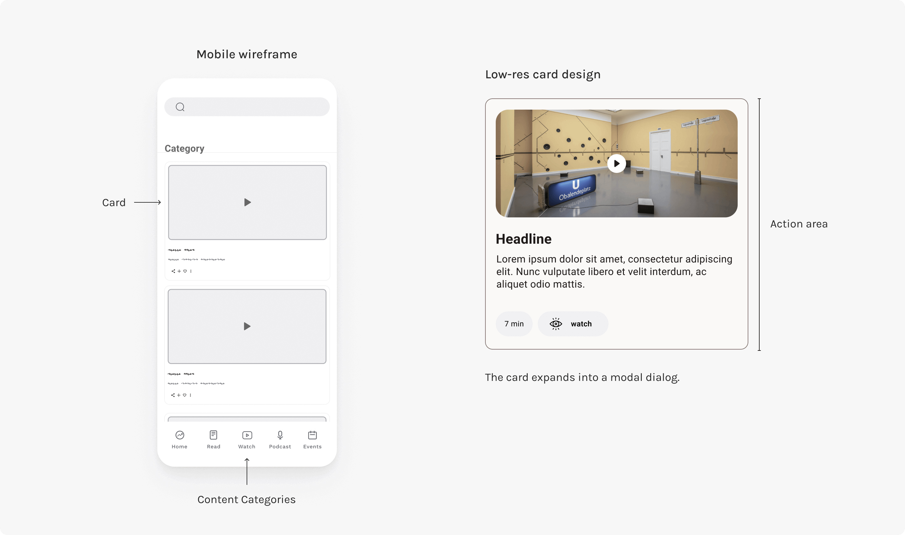
Card Design- low res. wireframes
Design
The final step was to design the user interface. I infused a more playful way of navigating content while focusing on user-generated, short-form content. This is the central pillar of content discovery and consumption.
Main Screen
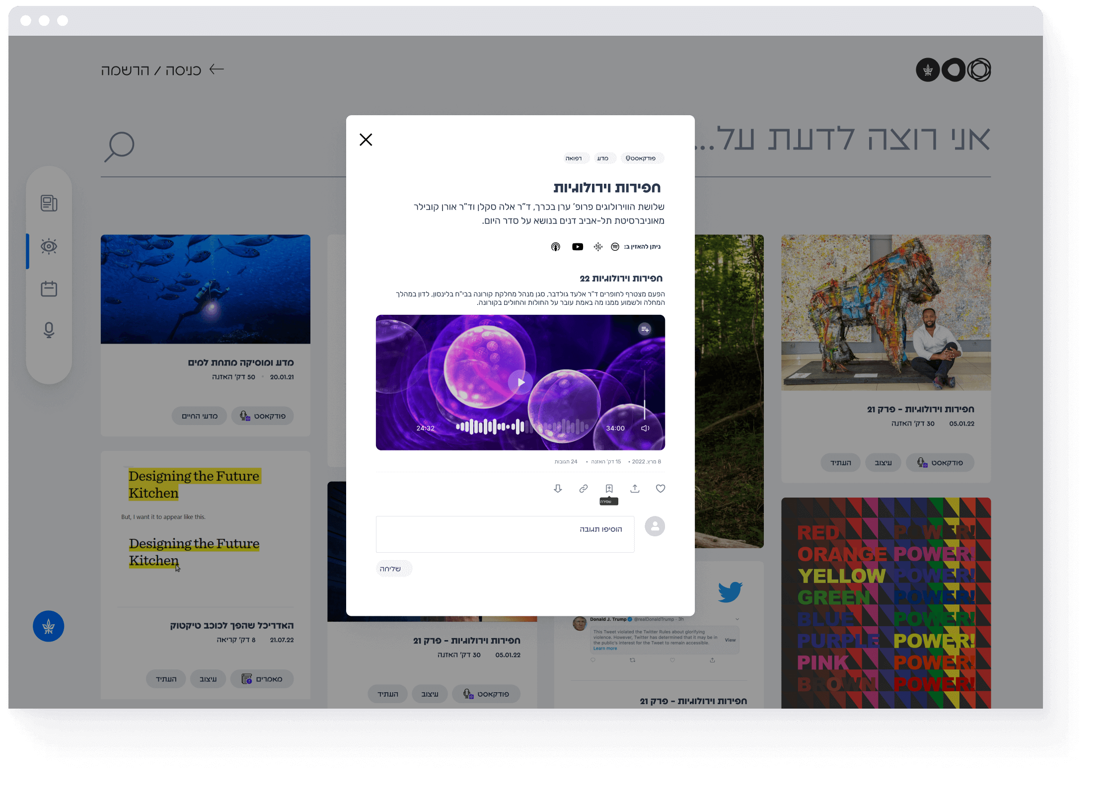
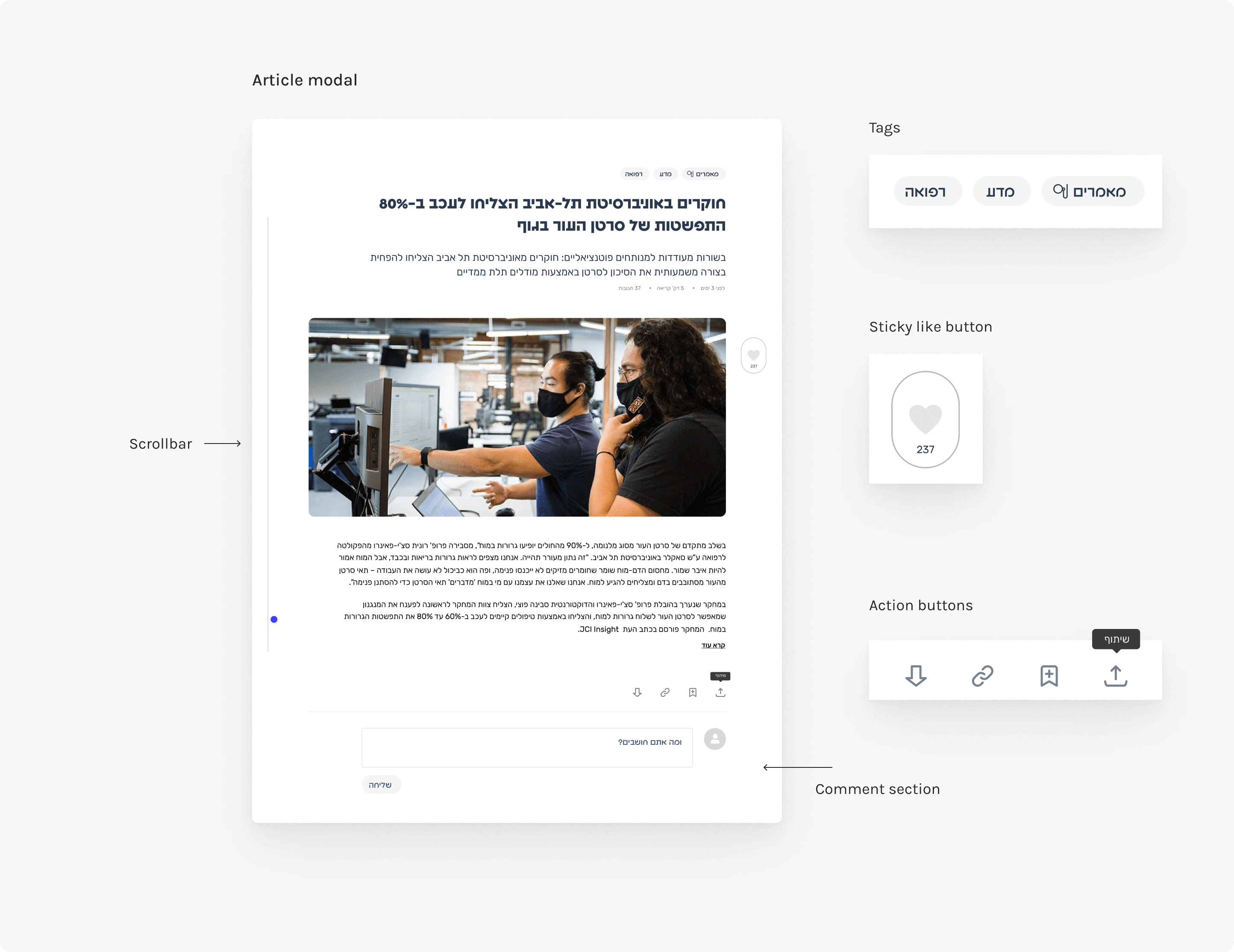
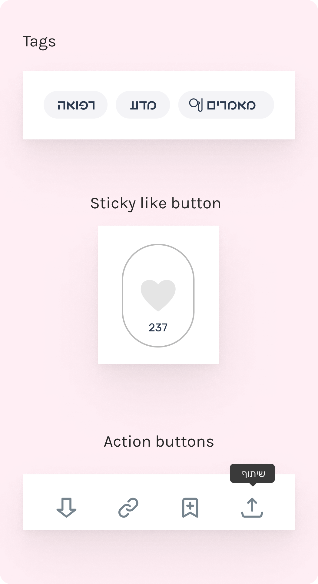
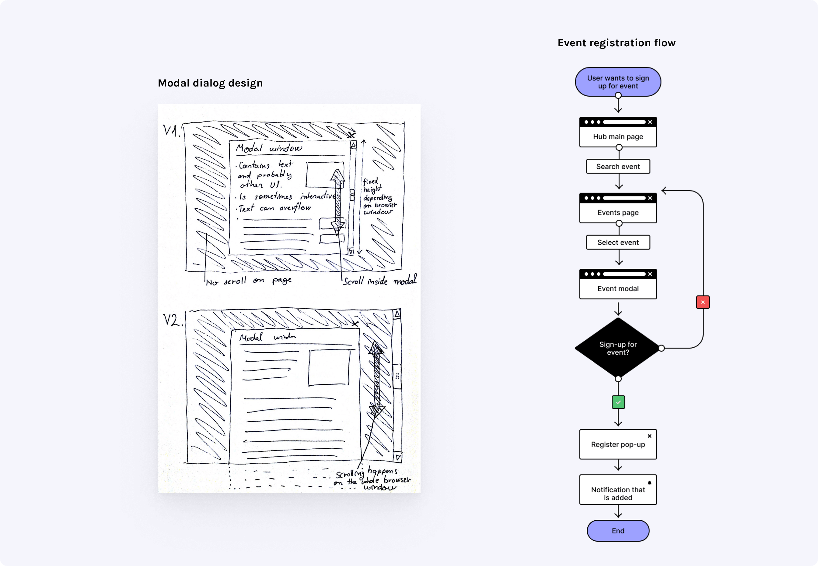
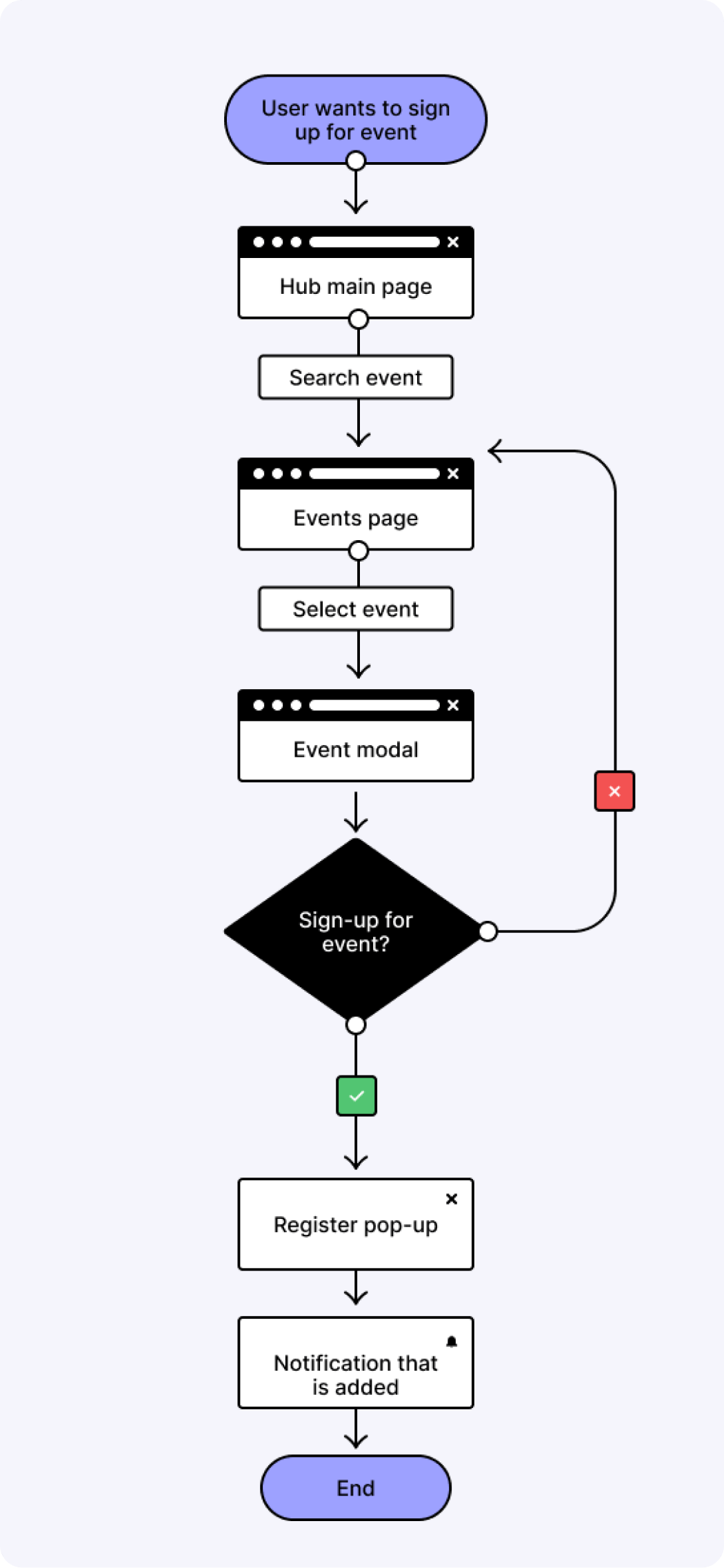
Modal Components