Client
Kibbutzim College
Project type
Web application
Role
UX Research, UI Design
Time
Nov 2022
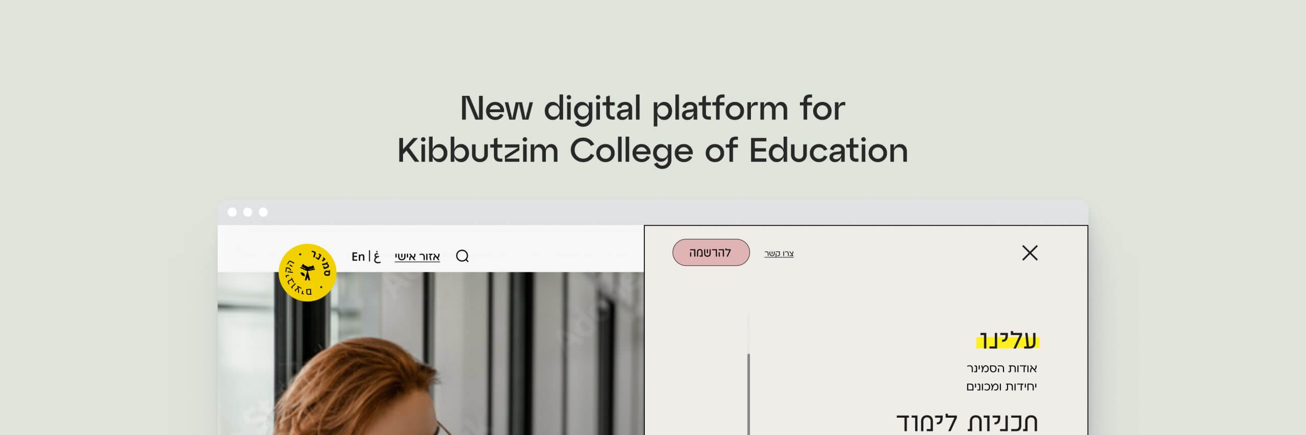
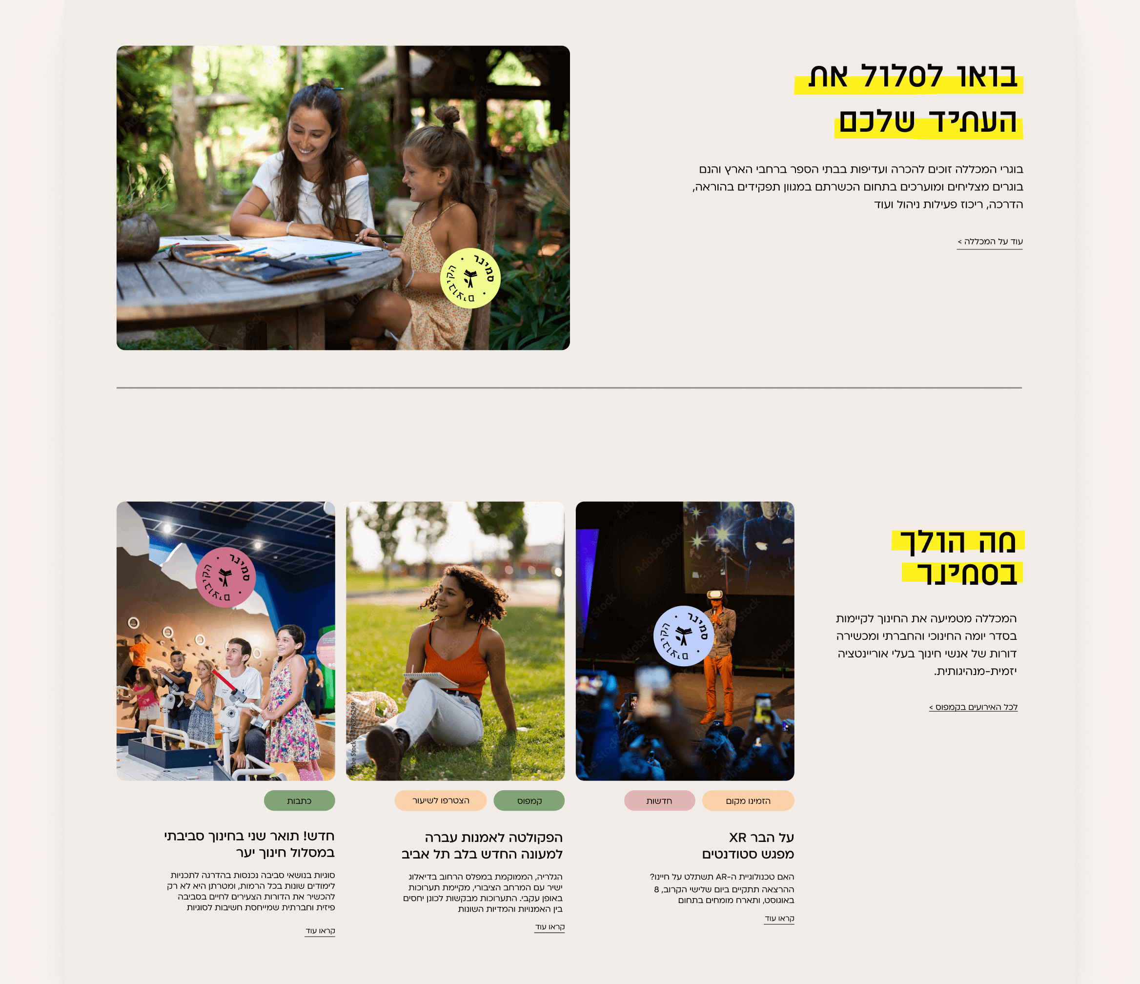
A new digital platform for Kibbutzim College of Education
Kibbutzim College of Education, Technology and the Arts is a college based in Israel.
My role was to lead website and mobile redesign which included: competitor analysis, user research, wireframing, prototyping and design.
Background
Designing a web platform for a college- Kibbutzim College wanted to redesign its platform to increase the number of college applicants.
The Problem
Colleges are businesses but not run as such.
After thorough research, It was concluded, that the college is a complex organization, structured into two areas: Academic Faculties, and Professional Services, both having a high number of resources.
My goals were:
- Increase enrollment at Kibbutzim College through the platform.
- Reduce the number of inquiries to academic coordinators and thus manage the load on the departments.
Design Process
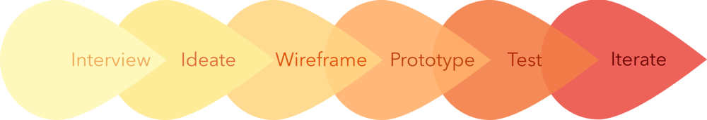
I conducted research, including competitor analysis and user interviews, and performed usability testing to validate design decisions. I designed wireframes, built mid-fi screens, and created a prototype to demonstrate platform functionality and flow.
Research
1. Competitive Analysis of Features
Conducting a competitive analysis, to understand how Kibbutzim’s college competitors are solving the problems of their target audience.
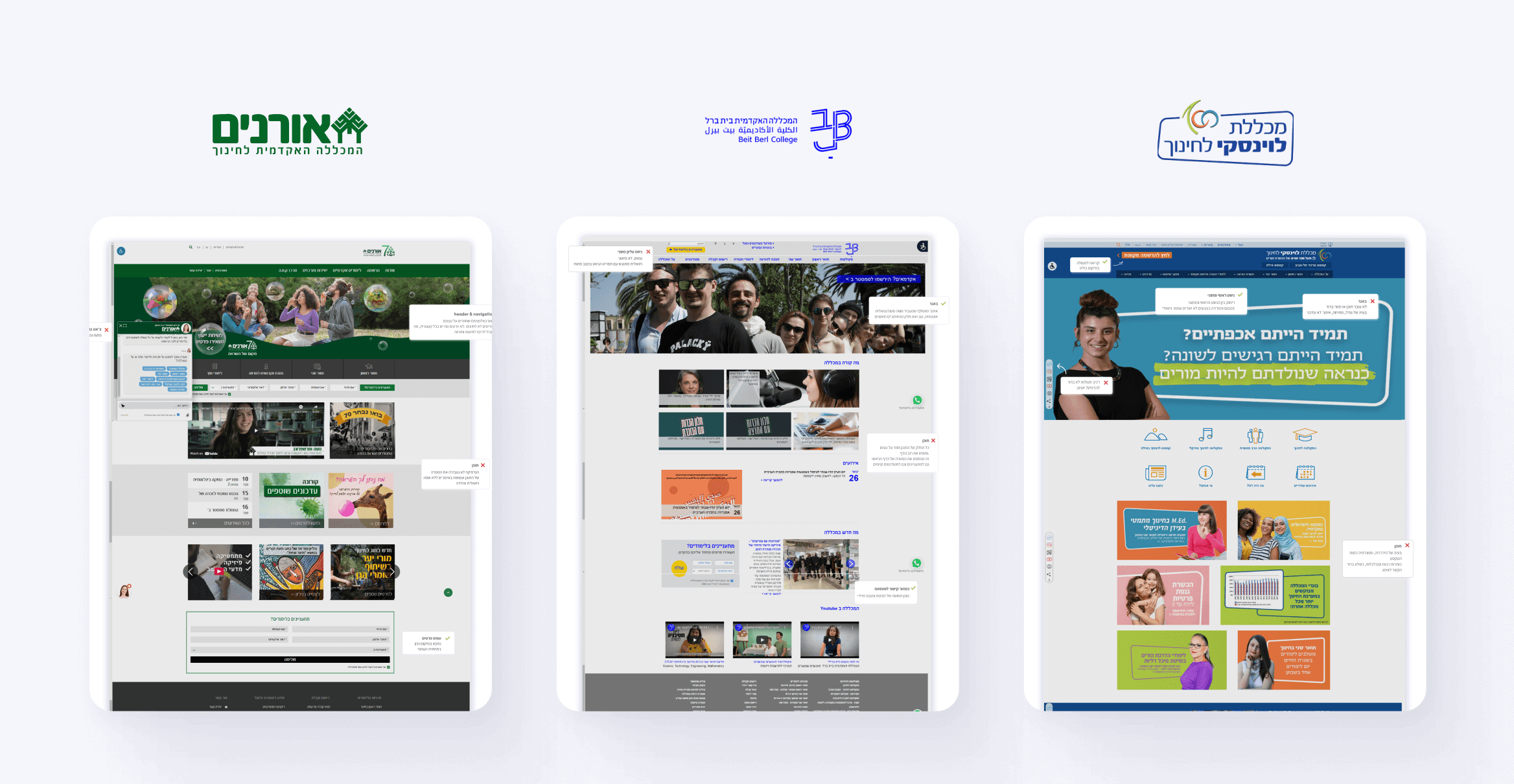
Kibbutzim college top 3 competitors
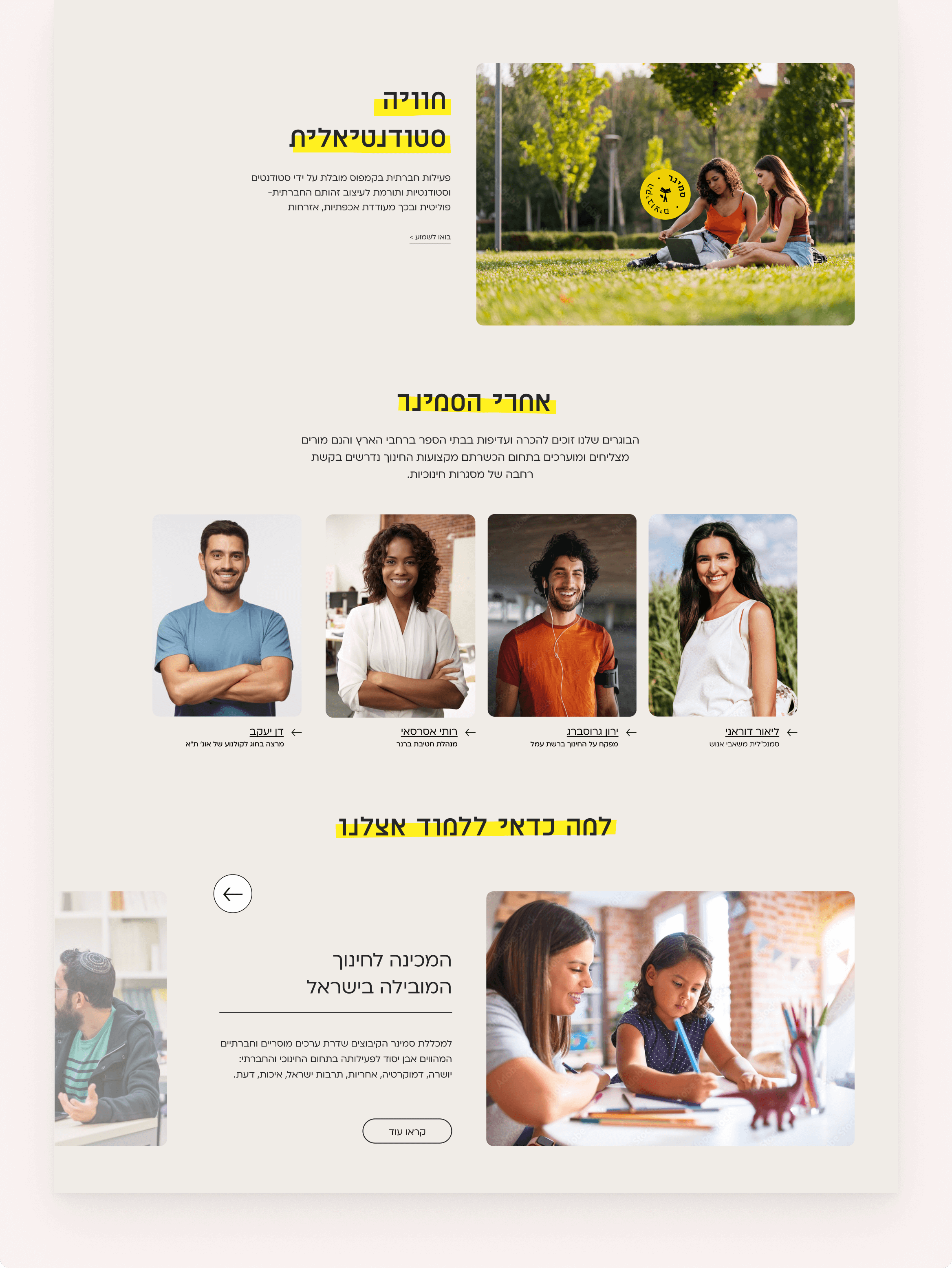
2. User research
In collaboration with the marketing team, I interviewed a group of candidates and students.
The main insights are:
- Students want to learn about specific things in as short a time as possible.
- Top pain point on college website is too much to read.
- Prospective students expect an immediate answer to their questions.
- 80% of students use smartphones to access college websites.
- Students want to learn about specific things in as short a time as possible.
- Prospective students expect an immediate answer to their questions.
- Top pain point on college website is too much to read.
- 80% of students use smart phones to access college website.
3. Investigation
Following user research, I analyzed and evaluated the current screens and found design, consistency, and UX issues.
screens/components before the redesign:
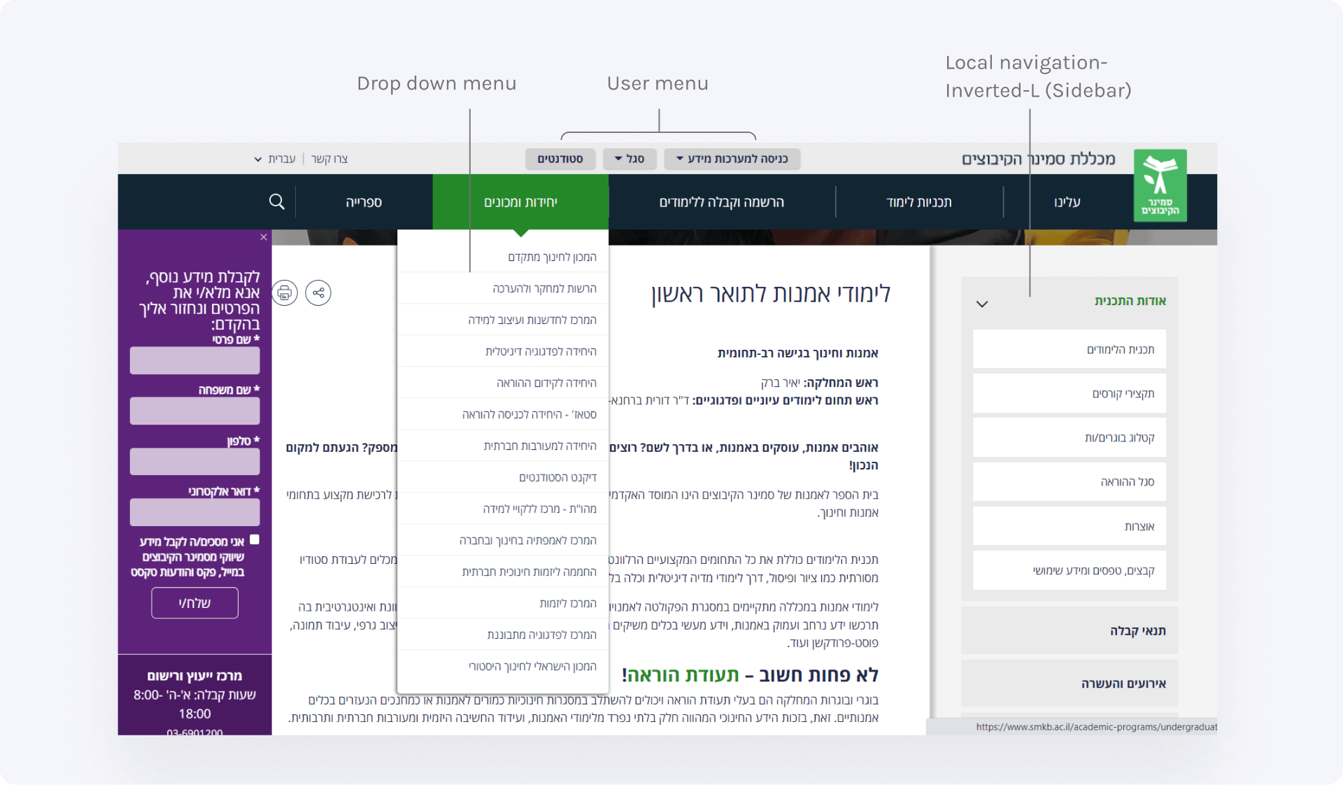
Global navigation- design and UX issues:
- menu items duplicate both vertically and horizontally
- drop-down navigation appears over content, damaging the visual aspect of the UI design.
- lack of hierarchy in a dropdown list making it tedious to interact with.
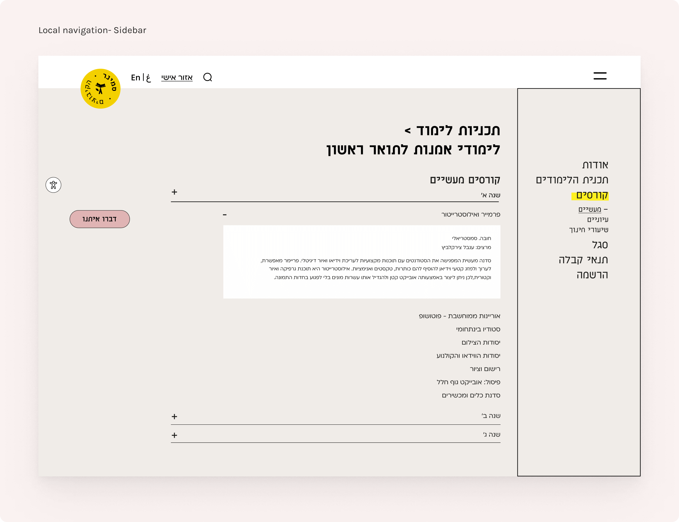
Local navigation- before
Local navigation- before
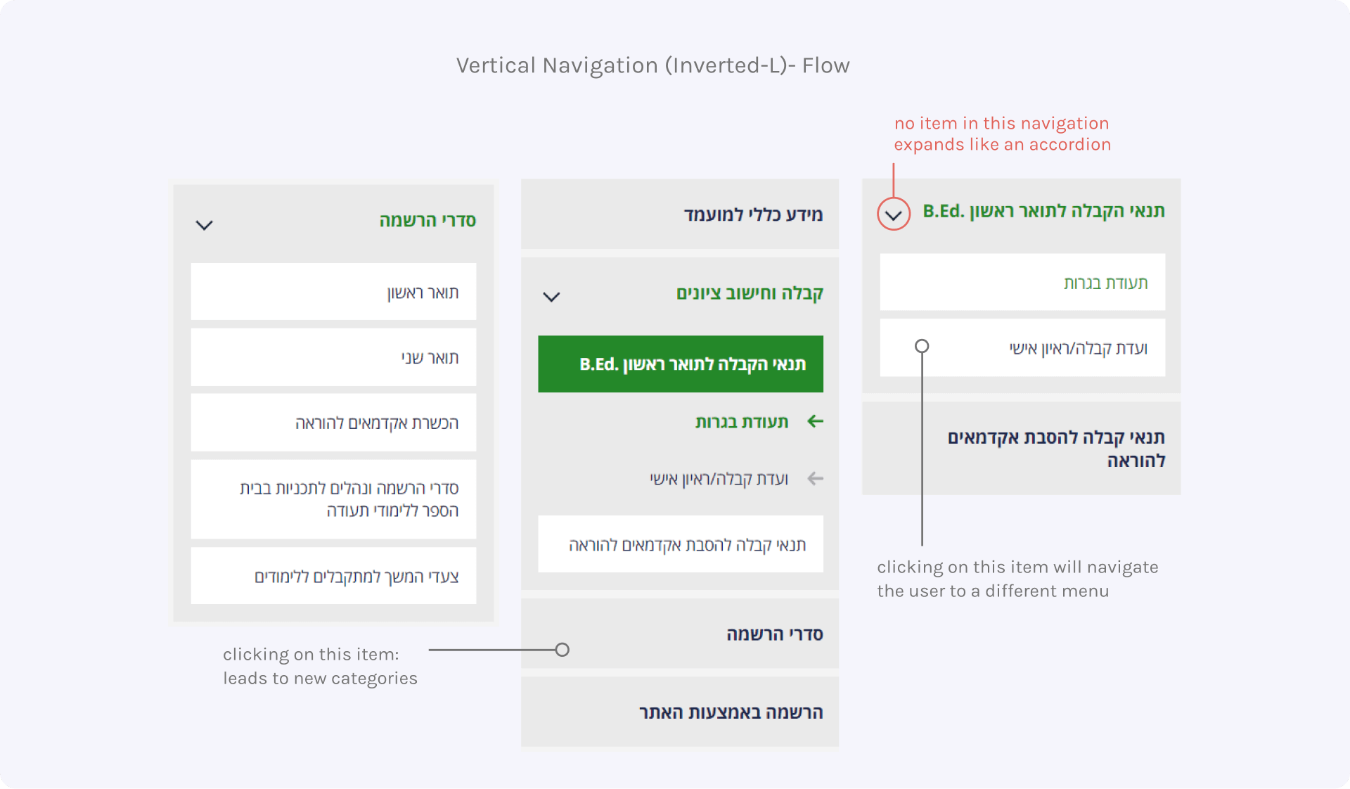
Local navigation- Design, and UX issues:
- Inconsistent navigation: no logic in structure, confusing flow, lack of hierarchy all leading to confusion and multiple clicks.
- UI language: arrows, expand/collapse UI, color indicating certain state- nothing follows familiar UI pattern.
- users can’t tell where they currently are in the context of where they can go, resulting in multiple clicks and a confusing overview of site structure.
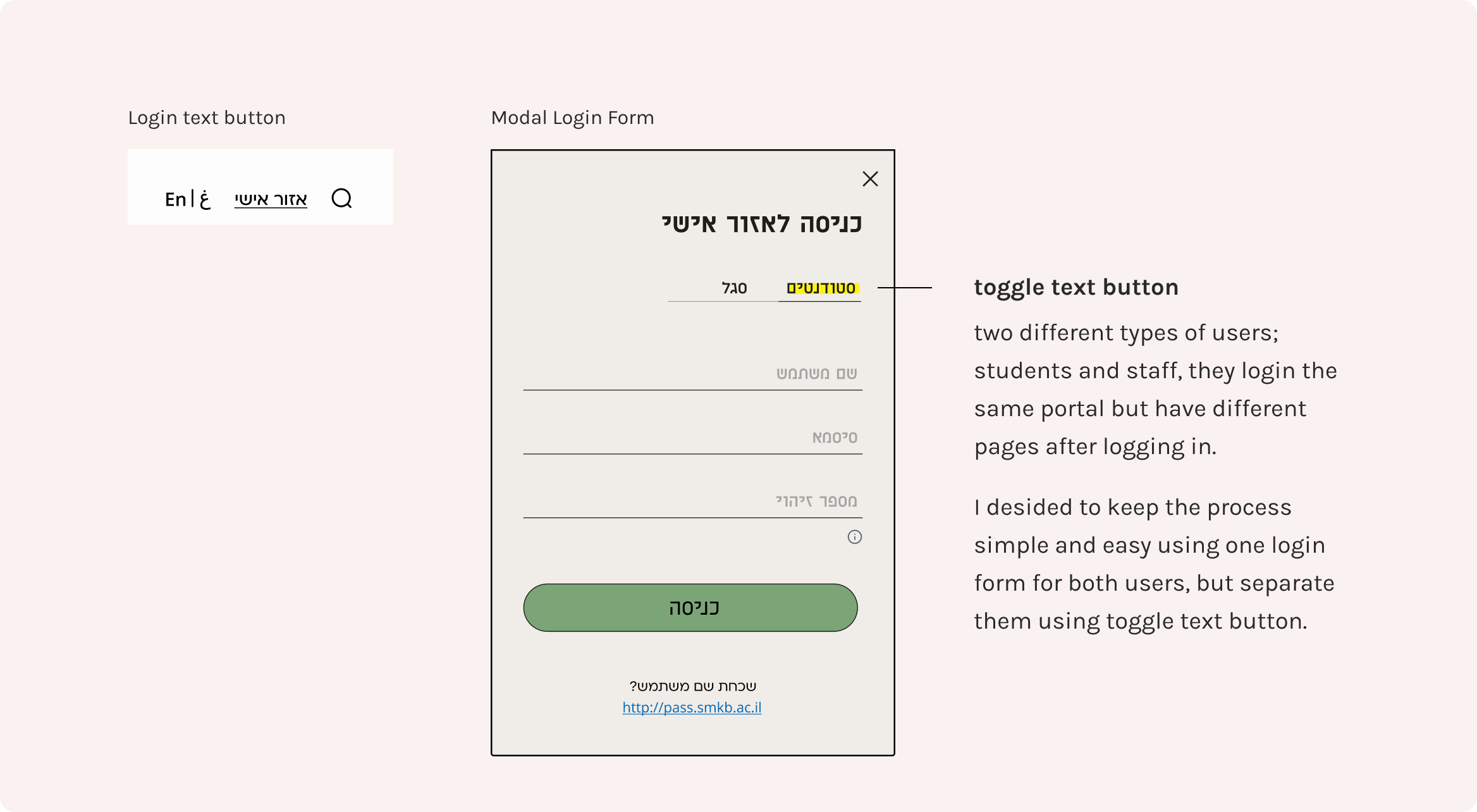
User menu- buttons & links- before
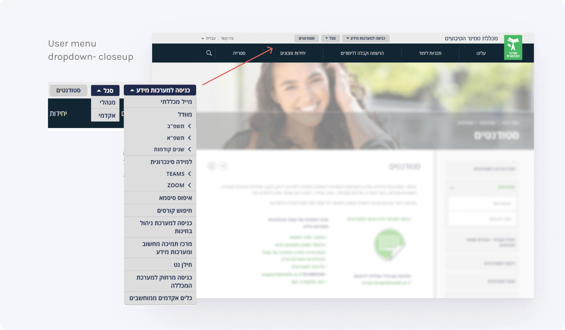
User menu- before
Design, and UX issues:
- too many subcategories, most leading to the same pages
- no hierarchical structure in subcategories
- massive drop-down appears over content
And MORE problems to solve:
- Contact. Contact button is linked only to contact form. Filling out the form and wait for a callback is the only way a user can contact the college. To put it gently, that would frustrate some users.
- CTA buttons. There are none. At all.
- Conversion Rate. Design, development and content are not “conversion friendly”.
Solution
After calculating all of these findings, my suggestions were:
1. Focus on business: Removing user-menu content from the header and navigation. All user-related content (student and staff); Moodle, Zoom, Google Teams, forms, etc. will move to the new web portal to separate the main website, from all the features students and staff use daily. The main website will focus on business and marketing goals.
2. Navigation. Navigation should be clear and intuitive.
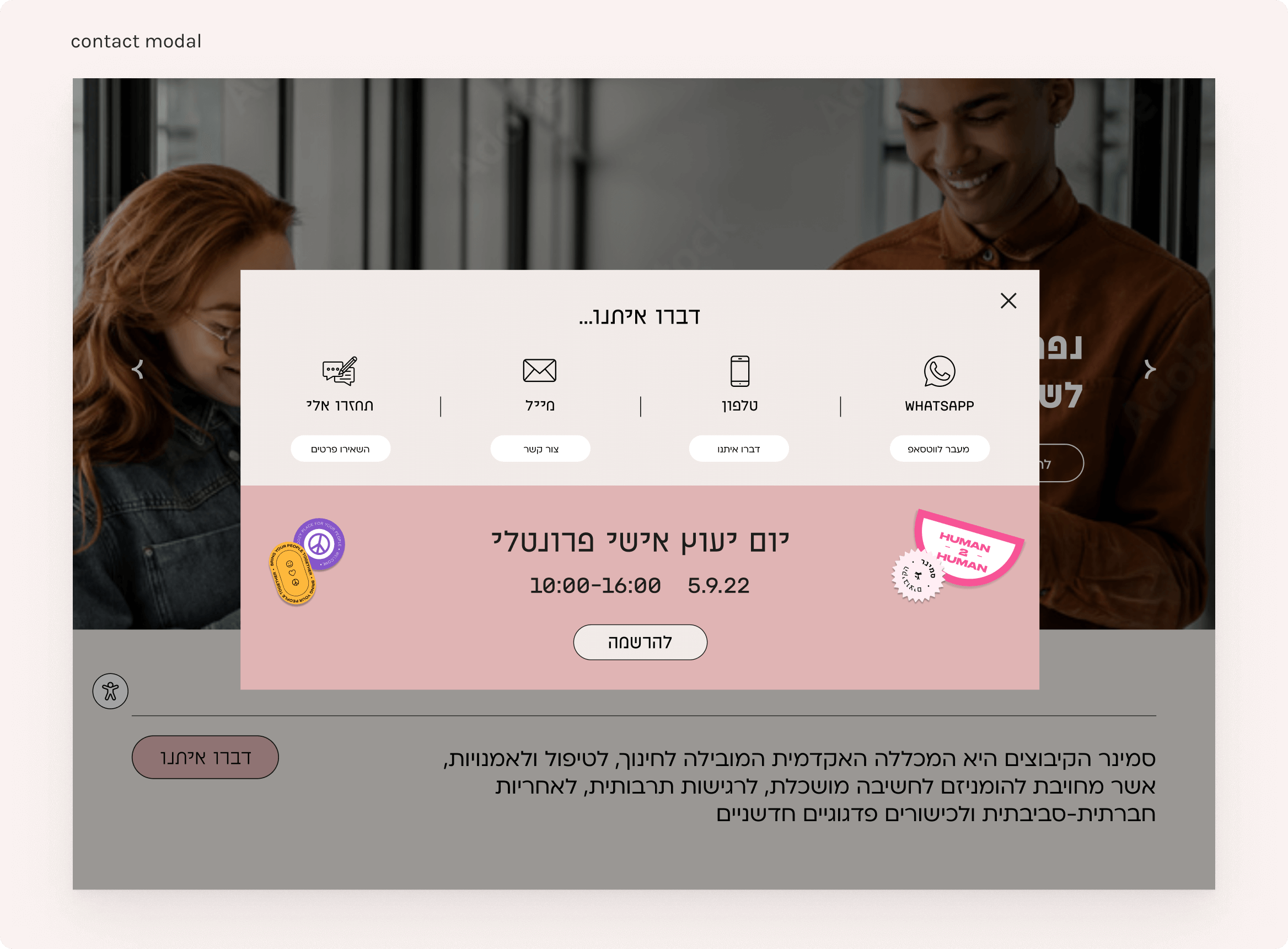
3. Contact app. Give prospective students a variety of options to contact the college in the most convenient way for them.
4. CTA buttons. Position primary and secondary CTA buttons in appropriate places that align with a user's experience.
5. Information Architecture. To address the critical usability issues like navigation and visual load a new information architecture had to be structured. Information architecture considers user needs, not reflecting the college's organisational structure.
Solution
After calculating all of these findings, my suggestions were:
- Focus on business.
- Navigation.
- Contact app.
- CTA buttons.
- Information Architecture.
Design process
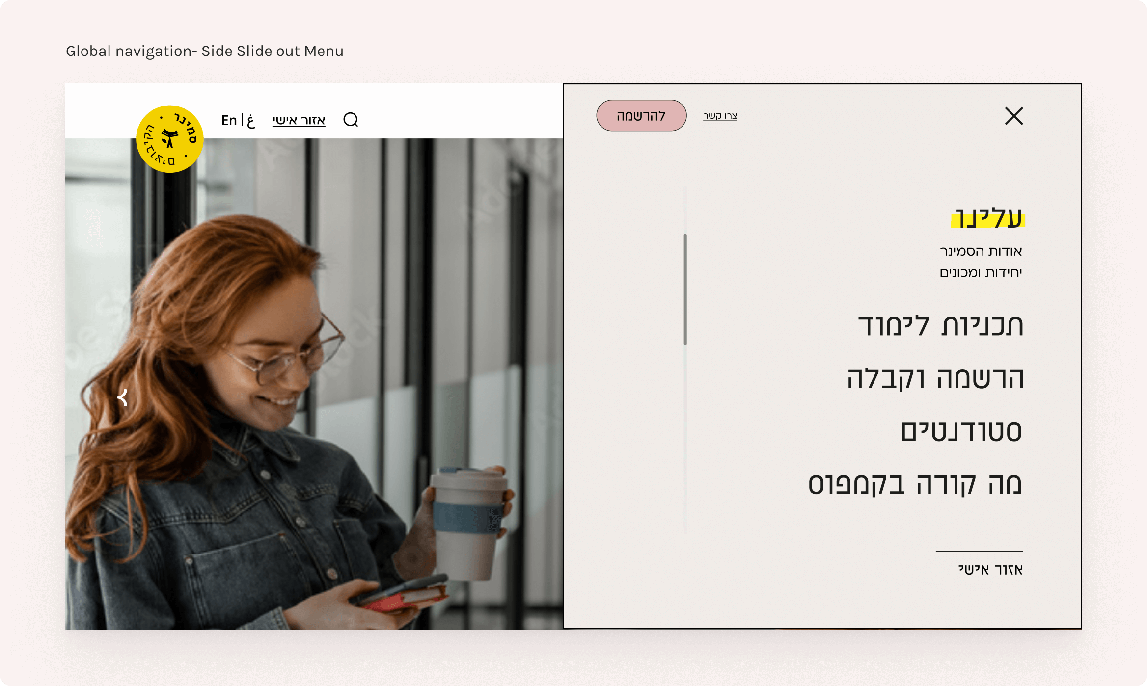
Challenge: Deciding the Layout
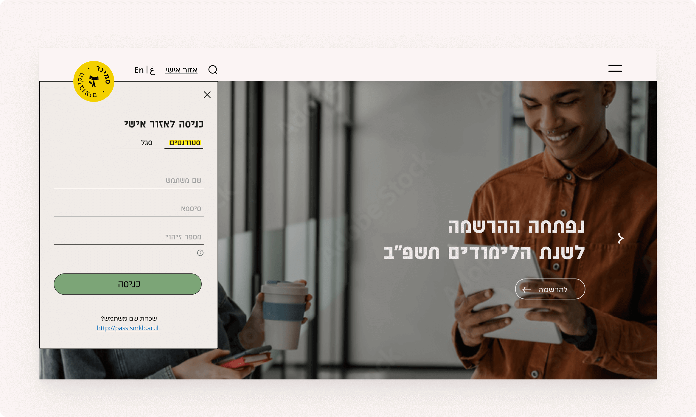
Designing the global navigation component, I had two options - Drop Down Menu or Drawer Navigation.
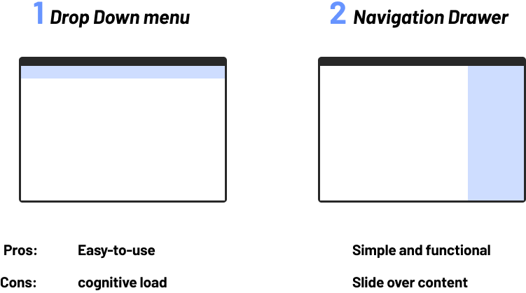
The two alternatives have their own pros and cons. On one hand, the drop-down menu provides easy access to top content and effective for getting users to where they want to go. On the other hand, Navigation Drawer that slides from the side by clicking on the hamburger icon is clean and organized and keeps the viewer’s attention on the main goal of the website.
How do I make the trade-off?
I aimed to rule out that hamburger menu is less discoverable and that it takes users extra effort to find the options they’re looking for. Although at this point I had limited usability resources I conducted A/B testing, asking the participants to complete a short scenario.
All subjects completed the task successfully, the average session time on the drop-down version and the hamburger menu version was the same. That means the hamburger menu has no negative impact on user experience in terms of accessing content. That's why I chose the hamburger menu in the final design.
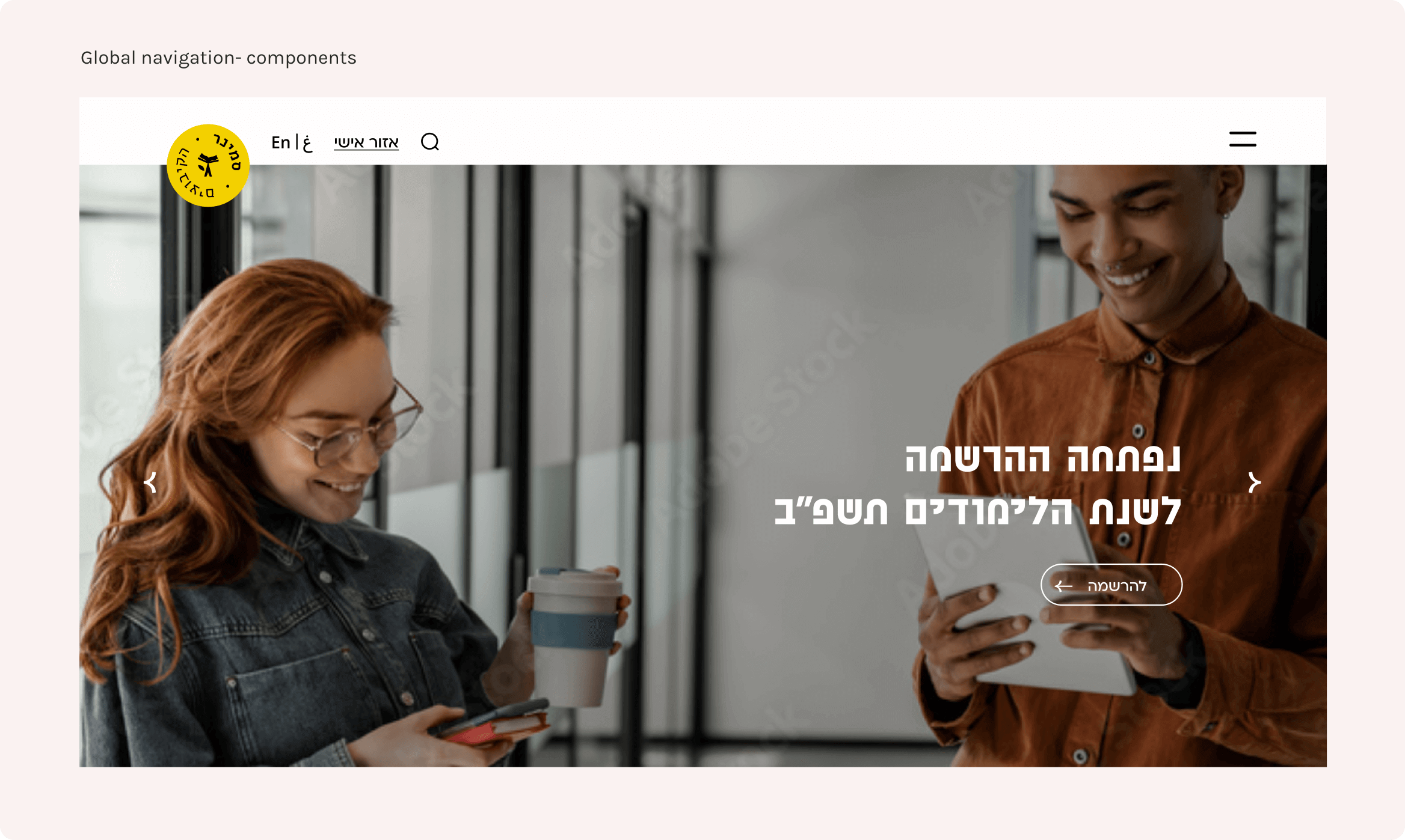
High-Fidelity Wireframes
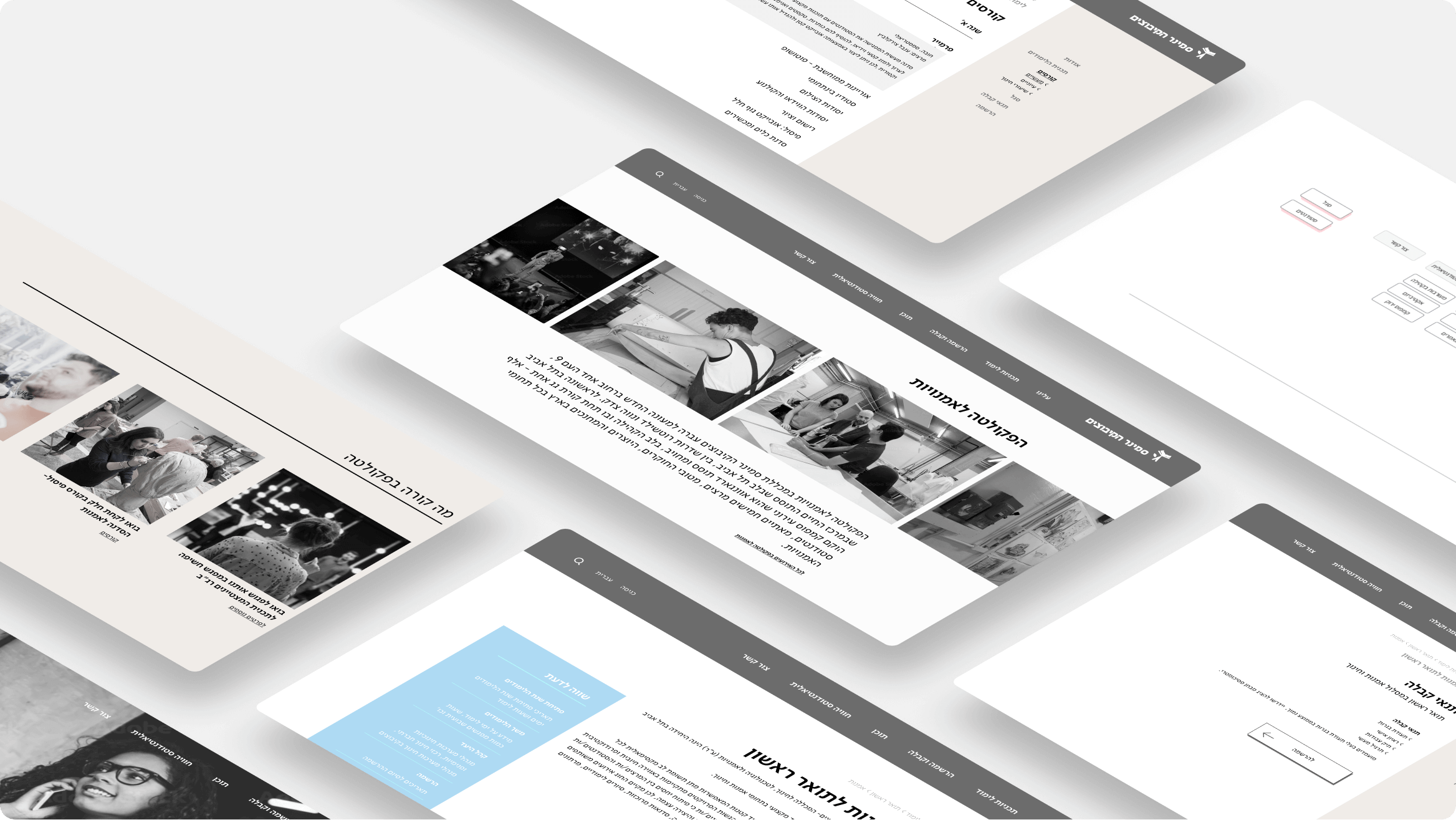
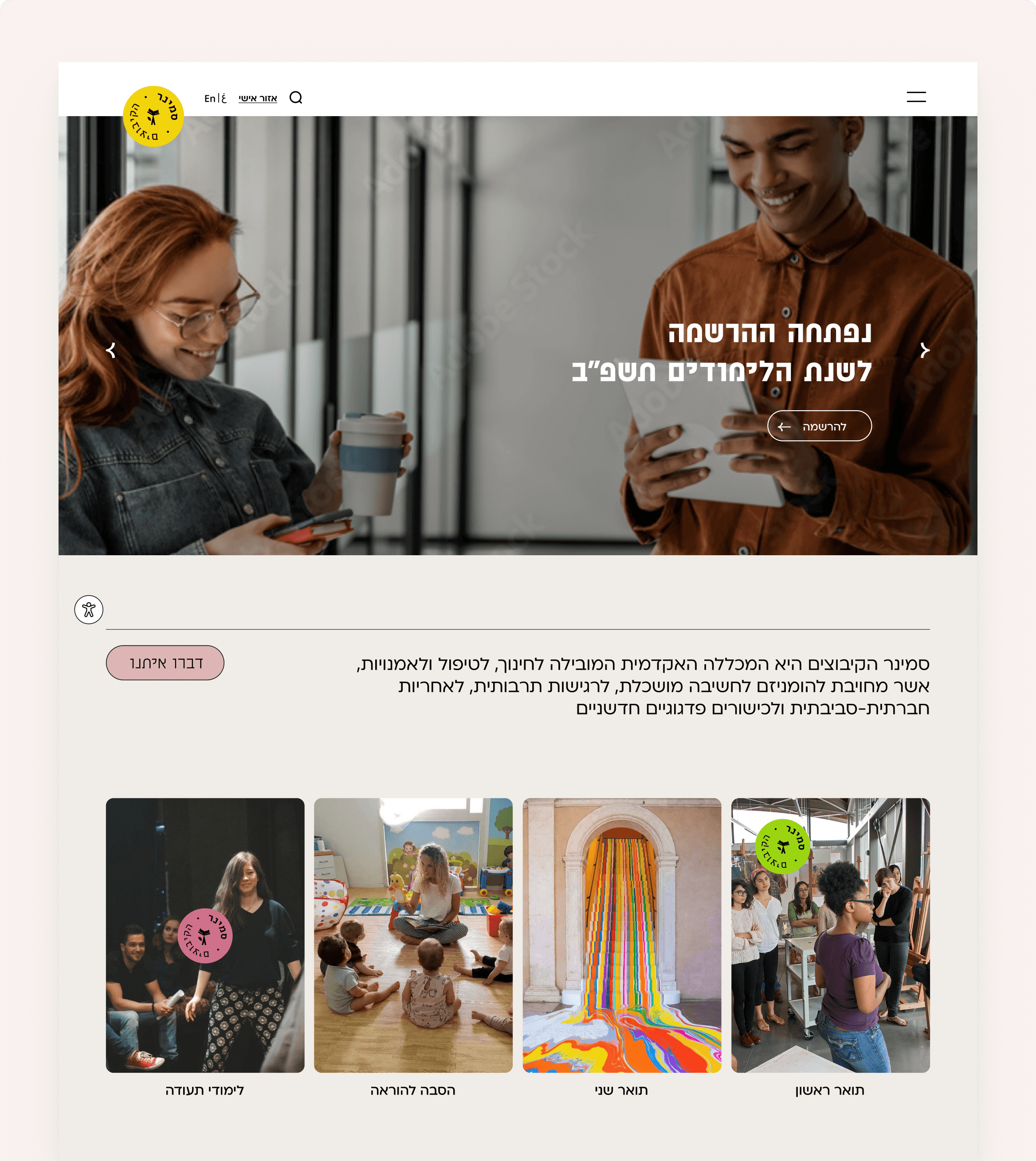
Final design
Navigation
User-menu login
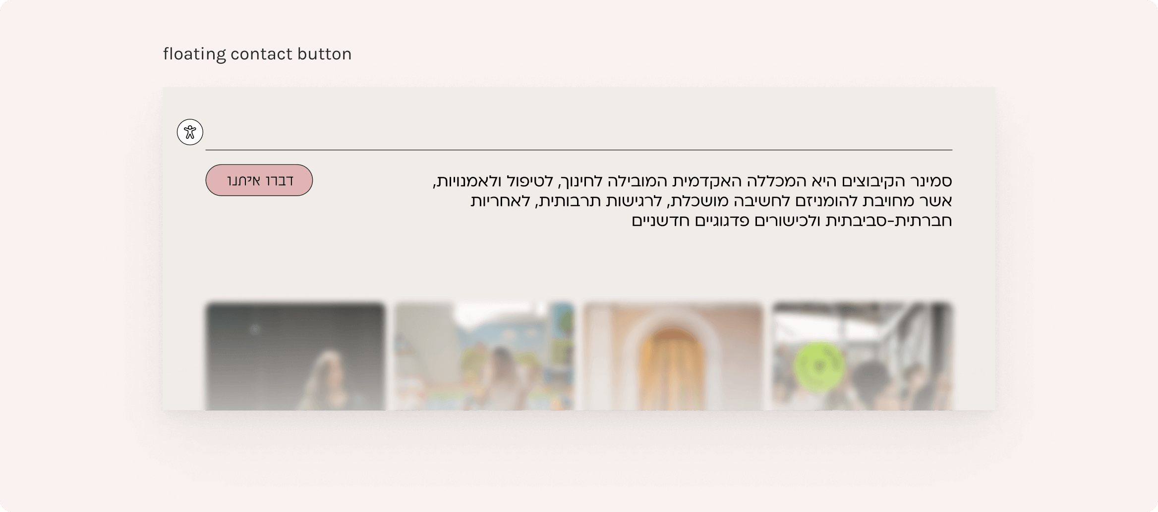
Contact app
Main
Conclusion
I am proud of not only how Kibbutzim College turned out to be, but also the process that brought me to the final solution. Design studio culture encourages production over research. Still, I can say with certainty that I reached the final result after thorough research, having the ability to formulate a UX strategy with a clear understanding of all parties involved in this project.